


(Photo by Kevin French/Icon Sportswire)
1. INTRODUCTION
The goal of this piece is to provide some context for plate discipline metrics (“PD metrics”), from a statistical perspective, as they are applied to pitchers. For example, “swinging strikes” (whiffs) are mentioned frequently on this site. But what exactly is a good swinging strike rate, anyway? And what about those eight other stats they list in the FanGraphs plate discipline section? Do they mean anything for pitchers? Hopefully, this piece will answer those questions and more. Then starting next week, I plan to write a weekly column where I will look more at individual pitchers and their recent trends in plate discipline metrics.
OK, so why plate discipline metrics? Aren’t those for hitters?
- They may have been devised with the hitters in mind, no doubt. But that doesn’t mean they can’t be useful for pitchers. In fact they are already being used as such. Playing with the data, some interesting patterns emerge which I believe can lend some further insight into pitching performances.
- These metrics look at some of the most fundamental underlying skills of pitching, as well as hitting. Pitching is essentially the opposite of hitting, so metrics designed for hitters should provide some insights to pitchers as well. Is the pitcher throwing the ball in the strike zone? Are batters consistently biting on balls outside of the zone? Are batters struggling to make contact at all? These types of questions are very important if one is interested in determining the true talent level of a pitcher.
- K% and BB% are critical measures of pitcher performance, but can be influenced by luck over the short term. Umpires are human, and there’s also the concept of “foul ball luck” which I’ll explain below. Looking at the plate discipline stats should provide some clues as to whether just how much you can really trust those K and BB rates.
- Most fantasy owners have moved beyond using ERA to evaluate pitchers, more to stats like FIP and SIERRA. What they may not know, is that these stats are extrapolated from strikeout and walk rates, among other things. If a pitcher is getting lucky on strikeouts, their FIP or SIERRA could be very misleading in a small sample. Looking at the PD metrics can really help find those over-valued and under-valued guys.
- The metrics should stabilize rather quickly. The individual data points are pitches and swings, whereas with K% or BB% each data point is a whole plate appearance. Having more data is always a good thing when it comes to statistics. This should allow for better predictions in smaller sample sizes.
- They help paint a complete picture. Looking at players through this lens is a different approach to a lot of the analysis you’ll find on this site. You’ll never see me analyzing GIFs of specific pitches, for example. Not that I don’t think such analysis is important – far from it! I’d certainly recommend consuming as many different types of analysis as possible.
Well, that sounds promising. But are there any caveats to using these metrics?
- The main caveat, and it’s a huge one, is that quality of contact is not considered at all. In the PD metrics, contact is just contact…a weak grounder or even a foul ball is counted the same as a home run. Obviously, this is not a true reflection of the values of those different results, whatsoever. So I think it’s important to recognize this upfront. Any analysis relying solely on PD metrics would be woefully incomplete without incorporating quality-of-contact data. Currently, the cutting-edgiest stats dealing with quality-of-contact are derived from Statcast data.
- The other main thing to keep in mind is just that this is a fairly new topic, and a bit complicated. As I mentioned earlier, there are nine different PD metrics on Fangraphs…it’s a lot to digest. Hopefully, this piece should help people make sense of it all. But I should also caution, this stuff is not 100% fully understood yet. I try my best, but I don’t exactly have a PHD in statistics! If you disagree with anything, please let me know. That kind of dialog could be very productive, since this is such a new thing.
2. RAW DATA
Now that we’ve got that out of the way, it’s time to get down into the weeds. To get things started, I’m going to quickly go through each of the nine PD metrics available on Fangraphs. For reference I’ll provide the definition, and then show in graphs how each one correlates with strikeout and walk rates. All graphs in this section include every qualified SP season over the last 3 seasons (2015-2017), with each dot representing a pitcher-year. Simple linear regression lines and R-squared values are shown as well. The goal here is basically to determine which metrics are relevant to strikeouts and walks, so we can trim down the list of nine into something more manageable. So with that in mind, let’s dive in:
First up, we have the three “Swing” metrics. Each data point for these metrics is one pitch.
1. O-Swing%: How often pitches outside the zone are swung at. Here are the graphs showing how it correlates to strikeouts and walks:
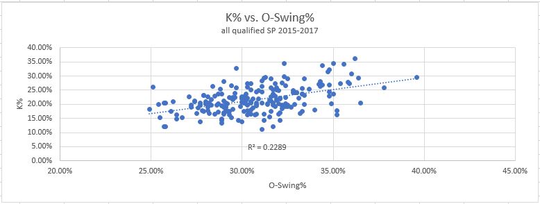
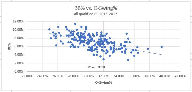
Clearly, this is a good skill to have. A higher O-Swing% has a beneficial effect on both K% and BB%, as you can see in the graphs. Strikeouts go up, and walks go down as O-Swing% increases. It’s important to note that the correlation here is not as strong as some others to follow. The data is not clustered tightly around the line, rather it’s fairly spread out and the R-squared values are pretty low as a result.
2. Z-Swing%: How often pitches inside the zone are swung at. Here are the results:
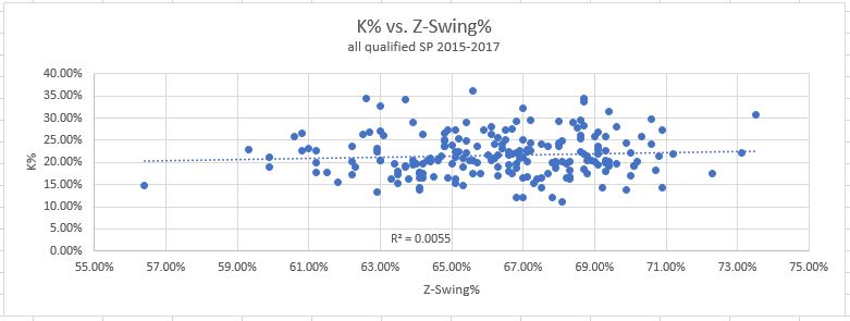
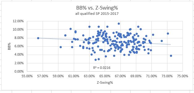
As you can see, this one has little to no correlation with either strikeouts or walks. The lines are practically flat, and R-squared values close to zero. This tells us nothing about strikeout or walk rates.
3. Swing%: How often pitches are swung at overall. And, the results:
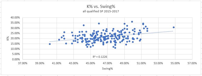
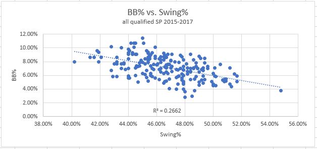
This one shows a bit of correlation, in between Z-Swing% and O-Swing%, for both strikeouts and walks. But, this is just because O-Swings are a sub-component of swings. So of course there is a little correlation, thanks to the O-Swings. But the Z-Swings, consisting of pure noise with no signal, are polluting the data and driving down the correlation, making it less useful.
Verdict: Keep O-Swing%, throw out the other two.
Next up, are the three “Contact” metrics. For these, each data point is one swing rather than one pitch.
4. O-Contact%: How often swings at pitches outside the zone make contact. The results:
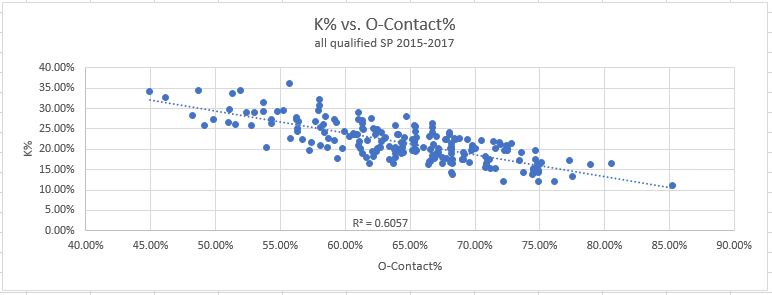
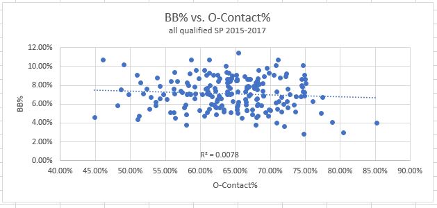
This has a strong correlation with strikeout rate, as to be expected. It’s slightly harder to strike someone out when they make contact. This is true regardless of the location of the pitch, so we should see this in all three “Contact” graphs. On the walk side, there is basically zero correlation. This makes sense, since all the data points are swings at pitches outside the zone, and it’s the non-swings at these pitches which inform walk rates (what we saw in the O-Swing% graph).
5. Z-Contact%: How often swings at pitches inside the zone make contact. And, the results:
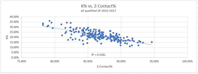
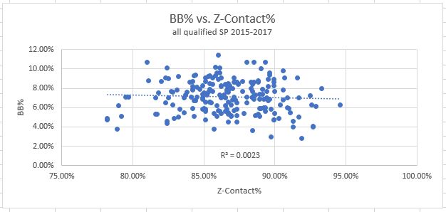
This tells a very similar story to O-Contact%. There is correlation with strikeouts for the same reason, and none with walks, for the same reason. I think this is one of the metrics that is much more helpful for hitters, than pitchers. Not much to see here.
6. Contact%: How often swings make contact overall. Without further ado, the graphs:
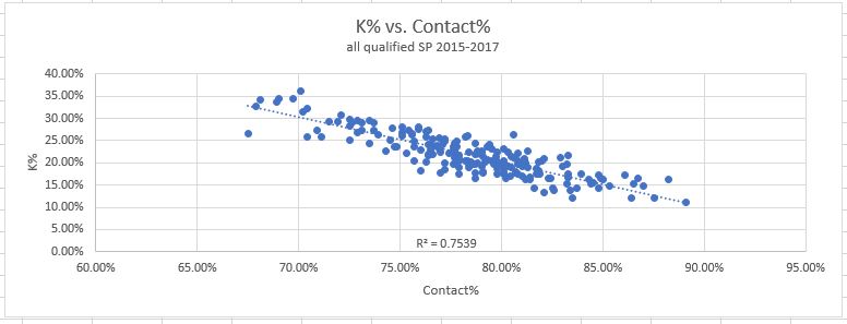
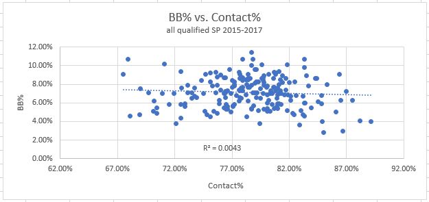
Now look at this. Once O-Contact and Z-Contact are combined into one metric, the correlation with strikeouts gets much stronger! It makes perfect sense that the overall Contact% has the highest correlation, as the absence of contact is a requirement for a strikeout, regardless of location. But this is good news for this exercise – since this one is stronger than it’s two sub-components, we can simplify our analysis by discarding the other two and focusing on this one.
Verdict: Keep Contact% only, throw out the other two sub-components.
The last three metrics form the “Miscellaneous” group, for lack of a better name. These three are unique and don’t have a shared theme like the swing or contact groupings. The data points are different as well.
7. Zone%: How often pitches are thrown in the zone (data points = all pitches). Wrap your head around these graphs:
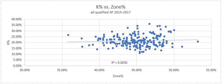
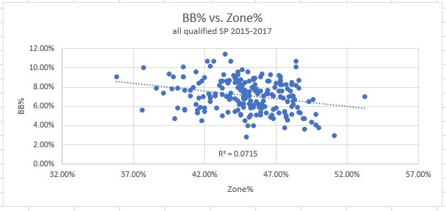
This was my first real surprise going through this exercise. Zone% shows very little correlation with either strikeouts or walks. I had expected a significant relationship with both to be honest, but they just doesn’t appear in the data. In the end it would appear as though throwing balls in the strike zone has very little predictive value on its own. There is a very slight correlation with reducing walks, but the R-squared value of .07 is nowhere near high enough to really mean anything.
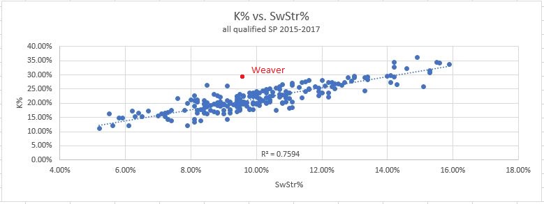
8. SwStr%: How often pitches are swung and missed at. This one also uses all pitches as the data points. And the results:
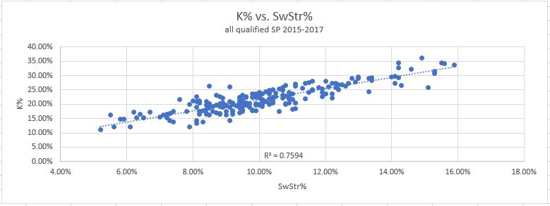
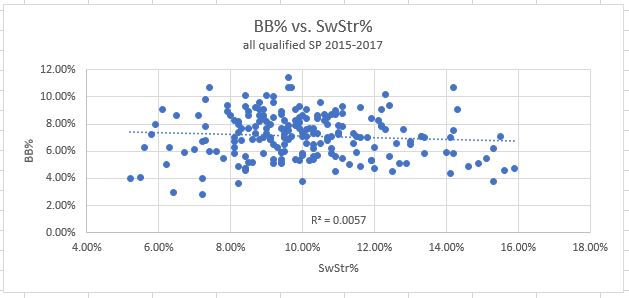
Again, like Contact%, we have reason to believe it should correlate very closely with K%. And indeed, it does just that. This has the strongest correlation with K% of all the metrics, though only by a hair over Contact%. When it comes to walks, swinging strikes have no correlation.
9. F-Strike%: How often the first pitch of a plate appearance is a strike. So this one uses plate appearances as data points, the only PD metric to do so. The results:
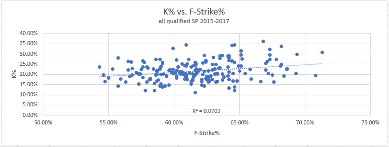
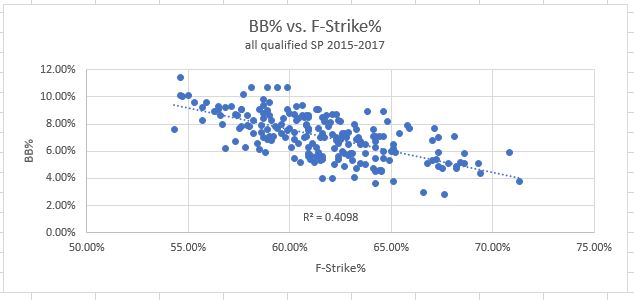
This was also a surprise – I expected F-Strike to provide an advantage in strikeouts. After all, strike one is already a third of the way there. But in the data there is actually very little correlation at all. But at least, it does have the strongest effect of any metric on reducing walks. Unfortunately, it’s still a rather low correlation compared to what we found for strikeouts. It would appear there is no PD metric which correlates very strongly with walk rates.
Verdict: Throw out Zone%, but keep the other two (F-Strike with lower importance than O-Swing).
To sum up, we have whittled nine metrics into the “Big Three”: SwStr%, Contact%, and O-Swing%. And then we’ve got the “Little One”, F-Strike%. Three of them affect strikeouts, and two affect walks. Now that we’re down to something a bit more manageable, let’s take a deeper dive into each of these, and see if we can really figure out what’s happening:
3. DISCUSSION
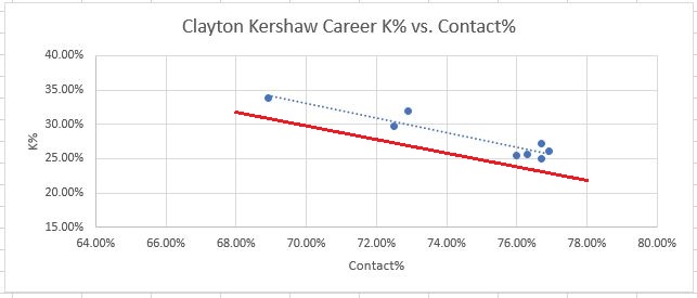
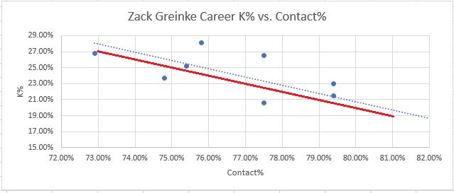
1. Swinging Strike% (SwStr%) should not be unfamiliar to readers of this site by now. When Nick gives the “gallows pole” award to the pitcher with the most whiffs every day, this is exactly what SwStr% measures, just in percentage form. It probably goes without saying, but SwStr% is important simply because a swinging strike leaves no chance for the umpire to interfere, unlike a called strike. This removal of any possible subjectivity makes it the most reliable way to consistently generate strikeouts. “BUT WAIT!”, some of you might be yelling at your computer screen. “Don’t some players have a skill in generating called strikes, allowing them to outperform their SwStr%? What about Aaron Nola, smart guy??” Well, yes, that’s true. Some pitchers do seem to have the ability to consistently generate more called strikes. For three years in a row, Aaron Nola has consistently beat his K rate as predicted by SwStr%, by about 3-5 points of K rate. Some other pitchers with excellent command seem to have this skill as well. Clayton Kershaw, for example, tends to beat his SwStr% by about the same amount as Nola and has done it over many more seasons. Here are Clayton Kershaw’s career numbers, in blue, compared to the general regression line in red:
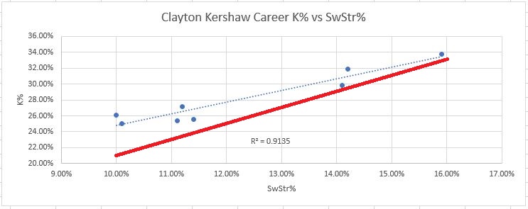
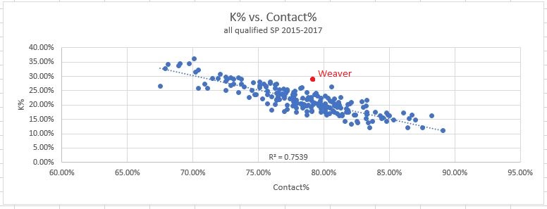
Eight seasons of data, and every one is above the red line. It’s remarkable, really. Do I have to tell you Kershaw is pretty good? But just because the best pitchers can (somehow) beat it, doesn’t mean it’s not worth looking at. Far from it! In smaller sample sizes, you’re guaranteed to run into much larger discrepancies than just 3-5%. For example, last year Luke Weaver outperformed his SwStr% by over 8% of K rate in 50 innings of work. A swing of eight percentage points in K rate is the difference between an average pitcher and a borderline ace, so that’s very substantial. This is a classic red flag situation, and you could only find it in the PD metrics. This is what Weaver’s 50 innings from last year look like, compared to the league’s full season results:
So there are two possibilities – either Weaver performed twice as well as Kershaw is capable of in this specific skill, or he benefited from some good luck.
Ok, so what’s a good Swinging Strike rate then? Swinging strike rates can be difficult to work with, because they fall into a very narrow band, typically between 6% and 16% for SP. League average is currently around 10.5%, and last year’s Cy Young winners were around 15%, so there is really not much at all separating the pack. The difference between, say 11% and 13%, is a huge amount, and this can make on-the-fly comparisons somewhat prone to error. I think it’s more helpful to think about this a little differently, in terms of expected K%. Going back to our graph and eyeballing the regression line, we can actually come up with an easy way to estimate K% from SwStr%. This brings me to…
RULE #1: To estimate K% from SwStr%, simply double it and add one. So a 12% SwStr rate should generally be expected to convert into a roughly 25% K rate over time.
What about sample size? Typically, stats can be said to have “normalized” when R-squared reaches .5 or higher. That indicates there is more signal than noise in the data. Under that definition, the K%-SwStr% relationship already has an R-squared value over .5 with just 14 days worth of data. It’s just barely over .5, but considering that is only 2-3 starts worth of data, it’s not bad. I was surprised it was that high so quickly. Unfortunately the only option I could find to control the date ranges for exporting PD metrics is by using FanGraphs pre-set date split options of “last 7 days, last 14 days, last 30 days”. Once the season has been going for 30 days, I can take another look at this. But it would appear that just a handful of starts would be enough to start taking the results semi-seriously.
2. Contact%. This metric, unlike SwStr%, is barely referenced here or any other fantasy analysis site. But I think it might be time for that to change. For starters, it has a very strong correlation with K%, about the same as SwStr% does. This is usually where people can get lost. You may be thinking, “Isn’t Contact% and SwStr% just measuring the same thing? If you whiff, you didn’t make contact.” Well yes, it does include whiffs in the data. But whiffs are only 10-15% of pitches at best, and there is another thing captured in Contact% which I think is important. Consider for a moment, foul balls. Foul balls are a common outcome; somewhere in the neighborhood of 17% of all pitches. Foul balls are unique in that they are contact, which is bad, but they are also sometimes strikes (depending on the count), and strikes are good!
Now let’s back up for a moment. To say that something is attributed to luck can be controversial. So before I do that, let’s look at the INTENT here. If a batter hits a bloop pop fly that lands for a hit, everyone can recognize the luck factor, right? The hitter did not INTEND to hit the ball weakly in the air, but they got a positive result anyway, so that’s good luck. Now apply the same logic to a pitcher and foul balls. Would a pitcher ever be TRYING to get a foul ball as a result? It seems incredibly unlikely to me. I can’t think of a situation where I would want that result over a “regular” (called or swung) strike. It would be a fine result sometimes, sure, but never the GOAL.
If we agree that pitchers aren’t ever trying to get a foul ball as the result, it seems uncontroversial to conclude then, that a pitcher’s distribution of foul balls with respect to the count is a “luck factor”. If a given pitcher is getting more foul balls early in the count, where they are a positive event, compared to later in the count, when they are a pure negative, they are getting lucky. Over time, the distribution of foul balls should be expected to regress closer to league average. In other words, the data points move closer to the regression line, the more time that goes by. If a pitcher was getting lucky in this way in a small sample size, their data point on the graph would be noticeably higher than the regression line. As an example, let’s take a look at Luke Weaver again. In addition to outperforming his SwStr% which we noted earlier, he also outperformed his Contact% last year. Here is our full-season Contact% data again, with Luke Weaver’s 2017 in red.
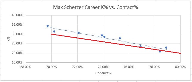
So he beat his Contact% by about 9 points over 50 innings, and if he did that for a whole season, it would be the largest discrepancy of any pitcher in MLB. Before writing him off as lucky, let’s consider the possibility that some pitchers could consistently beat their Contact-predicted K%. I wasn’t aware of any pitchers with a reputation for this, so I tried to find some. First I checked Aaron Nola, and nope, his numbers are very close to Contact-predicted K% for his career. So then I hand-picked a few pitchers with long MLB careers to maximize data points, but after 2002 (when plate discipline metrics began being tracked). I tried to pick some good pitchers, and some less good. Here are the results, each year of their career as a separate dot, with the general-population regression line in red:
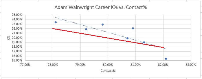
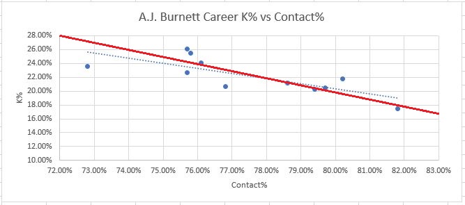
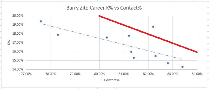
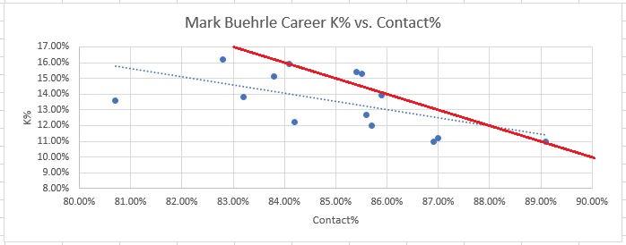
Please note, the scales on each graph are different. That was the only way to get the data centered around each player’s data points for clear visibility, but it can make comparisons a bit confusing. For example Barry Zito’s discrepancies are smaller than Kershaw’s.
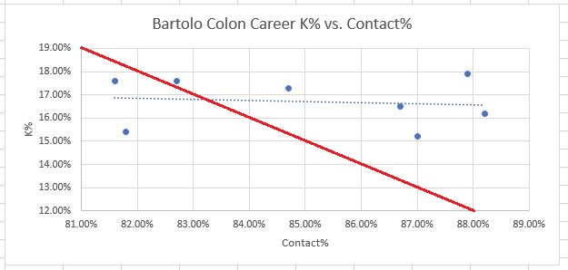
Secondly, what are you up to, Bartolo Colon?? His graph is crazy! There’s no downward slope at all…Contact% doesn’t seem to matter to him. I have no explanation for this.
Also, there does seem to be some repeatable skill in beating Contact%. The elite pitchers (especially Kershaw and Scherzer) appear to have this ability to some extent. This was surprising to me, but still, if anyone could do it it’s those guys. Also, it’s a fairly small amount that they are able to beat the metrics by. Scherzer for his career beats his Contact% consistently by about 2-3%. Kershaw is the best, again, consistently beating his Contact% by about 4%. And again, I don’t really have an explanation for this. Devil voodoo magic, perhaps. But it should serve well to provide context. Again we can ask ourselves, is Luke Weaver twice as good as Kershaw at something?
Similar to SwStr%, Contact% has such a strong relationship with K% over time, that it lends itself to creating a quick rule to convert Contact% into K% for on-the-fly comparisons. Again eyeballing the regression line, we can come up with the following:
Rule #2: To estimate K% from Contact%, simply take the inverse percentage. So if Contact% is 75, you should expect roughly a 25% K rate.
In retrospect, I almost feel this rule could have been predicted even without any data. After all, a pitcher is always trying to avoid contact, and you need to avoid contact on strike three to get a strikeout. So logically, it makes perfect sense that the Contact% is a pure measure of strikeout ability, and K% would regress towards overall non-contact% over time. But it’s still nice to see the data match the theory with such accuracy. Seriously, the regression line fits perfectly. Sometimes math is cool.
The sample size for using this rule seems to be pretty close to SwStr%. With just 14 days of data, R-squared is over .5, lower than SwStr% by a hair. I’ll take another look at this after 30 days have passed.
3. O-Swing% rounds out the “Big Three.” This one is clearly very different from the other two. For starters, it doesn’t have nearly as high correlation with either Ks or BBs that Contact% and SwStr% have with K%. However, it’s unique in that a higher O-Swing% is beneficial to the pitcher for BOTH strikeouts and walks. No other plate discipline metric moves the needle positively in both directions at the same time, so to speak. Considering that strikeout-to-walk ratios are the crux of what we’re interested in, there is a lot of value in moving both stats positively at the same time. It may also be possible, maybe even likely, that inducing swings outside the zone has benefits in the “quality-of-contact” realm as well. Taken together, I feel comfortable placing O-Swing% roughly in the same ballpark as Contact% and SwStr% in terms of overall importance to pitching success.
Because the correlation is much lower though, I don’t think that O-Swing% really is a good candidate to create any quick rules like we did for the two strikeout metrics.
4. F-Strike% is something that game announcers love to mention, but may not be super important in the grand scheme of things. It has the highest correlation to reducing walks, and deserves a mention for this fact alone. However that relationship is still not terrible strong. It seem that walks are just inherently unpredictable compared to strikeouts, at least from PD metrics. I’m guessing this is due mostly to the fact that umpires are human and make mistakes constantly. For strikeouts, half of strikes don’t require an umpire, as swinging strikes are 100% objective. But for balls, every single one is determined by an umpire subjectively. Bring on the robot umps!
Until then, we can and should expect walk rates to fluctuate a bit for no discernible reason.
4. CONCLUSIONS
- Over full seasons of data, strikeout rates correlate VERY closely with SwStr% and Contact%, for reasons that make perfect sense, and some of the variation can be explained by luck factors. This allows us to create some easy rules to predict K% from these two metrics, and find the lucky or unlucky pitchers in a small sample that are unlikely to hold up for a full season.
- To Estimate K% from SwStr%, double it and add one
- To Estimate K% from Contact%, take the inverse percentage
- Some specifically skilled pitchers may be able to beat these rules, but over the long term only the best pitchers can do this, and only by a small amount. Given the nature of statistics, there is also a margin of error to consider. One should be cautious in their predictions, and not overreact to minor discrepancies of a couple points here or there. However when the discrepancies get to around 5%, this is larger than any pitcher has been able to demonstrate consistently, and should serve as a red flag.
- For walk rates, none of the metrics show a high enough correlation to make such rules. Walks are unpredictable in nature, thanks to human umpires. O-Swing% and F-Strike% are certainly good, but not really guaranteed to improve walk rates. Throwing balls in the strike zone does not even appear to be a factor. For walks the only thing we can predict is their unpredictability.
Starting next Thursday, as a new weekly column, I’ll be putting this information to use by actually examining various pitchers, and discussing their plate discipline trends.
5. APPENDIX A – RANKINGS
Four metrics are still a lot to review in tandem, so I thought it might be fun to combine them into one. So I did that, basically combining the 4 metrics weighted as follows:
- Contact%: 3 points
- SwStr%: 3 points
- O-Swing%: 3 points
- F-Strike%: 1 point
This is somewhat arbitrary and not super-scientific, which is why I put it at the end. Take this with a grain of salt. After doing the calculations, most of the numbers came back in the 60-100 range, so I decided to just use the grading system we all remember from school. That way the grades could serve as tiers. Note these numbers are not tied to real world production in any sense, like runs or wins. They are just a number you can use to compare different pitchers to each other, using purely the most important PD metrics. Here are the 2017 results for all qualified SP:
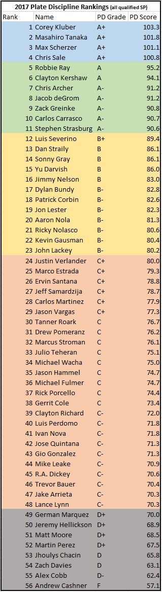
I don’t want to give the impression that it’s easy at all to get a mark over 100. In 2016, only one pitcher managed this – it was Scherzer and he won the Cy Young. 2017 was simply a great year at the top end. These guys did their extra credit assignments.
That being said, the results are pretty interesting. Last year’s Cy Young winners are two of the top three, so that made me feel somewhat validated. Just remember this completely ignores quality of contact, and the list should make a lot of sense. If you see a guy lower than you expected, it’s probably because he’s good at managing quality of contact. Jake Arrieta, for example, is probably not a “C-” grade pitcher overall. Likewise, Tanaka is nowhere near Kluber or Scherzer overall. He’s very prone to giving up home runs, and plays in Yankee Stadium, which is a double whammy of bad news for a pitcher. But there’s no denying he’s got the skills to put up elite K rates. Chris Archer is a similar story, only less extreme and he gives up his homers on the road.
Even though quality-of-contact is a huge missing component, and of vital importance to real-world MLB teams, there are a couple reasons why it might actually not be a bad idea to focus more on the PD metrics when it comes to fantasy:
- Strikeouts are usually their own category, or they are worth points by themselves.
- BABIP luck factors tend to make pitchers who rely on quality-of-contact a lot more volatile. Just look at Dallas Keuchel’s ERA over his career. He was never an elite strikeout/walk guy, but he managed to win the Cy Young on the strength of controlling quality-of-contact extremely well that year. But the year after winning his Cy Young, his BABIP went up by 35 points, and with it his ERA rose to over five. Strikeout guys tend to be more bankable. You can’t get BABIP’d to death, if you don’t allow contact in the first place.
See you next week, when I start diving into individual pitchers and their 2018 performances through the lens of PD metrics.
