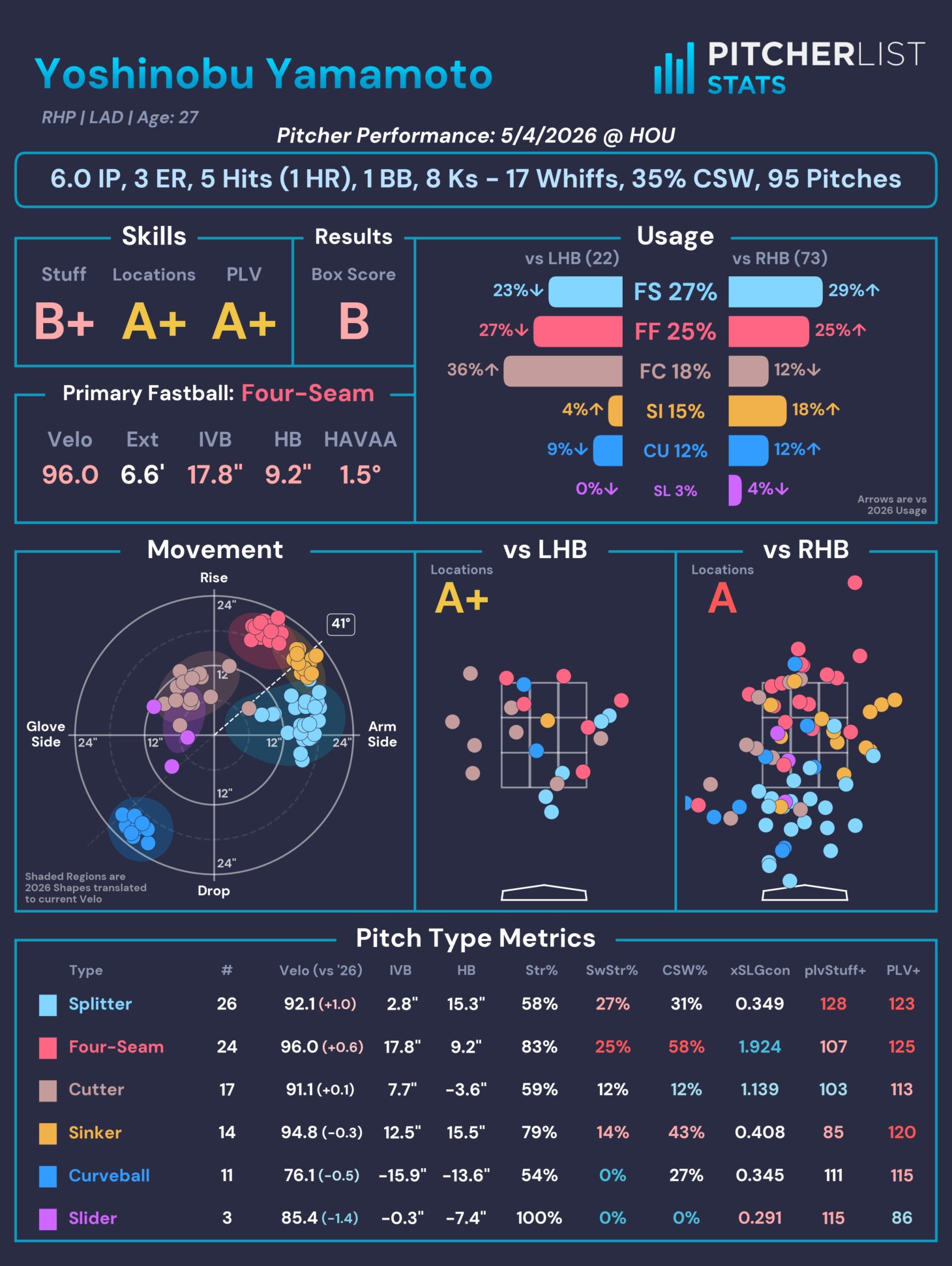
You might have seen a new thing appear from Pitcher List on social media across the last two months: Our @PitcherListPLV account that publishes a pitcher card of every SP during the season. For example, here’s Yoshinobu Yamamoto’s card from Wednesday night’s game:
We took a long time iterating on its design, choosing the metrics to feature, and, more specifically, how we want to display the information. There has been one specific decision we made that has attracted a lot of attention – Our Results letter grade, which attempted to answer a common question:
“How good was that start?”
A seemingly simple question that hides significant nuance. There is a daunting amount of stats and metrics available for every start (with more coming out all the time, courtesy of MLB and their Statcast data), so distilling everything down to a single value feels impossible. Did they get strikeouts? Did they locate well? How sharp were their secondaries? Were hitters fooled into chasing often? What was their sequencing like? Did they get hit hard? Did those hard hits land for hits or find gloves? How many innings did they throw? How did they maintain their velo late in the game? The possibilities for judgment criteria are functionally limitless. So I decided to let everyone else do the work.
Data Acquisition
I gathered box score data for starts in the 2022-2025 seasons (hat tip to Retrosheet for providing easily accessible data) and set up a web app that allows anyone to grade a randomly selected box score from A-F (please click through and grade some starts).
We received over 4,500 responses, which ran the gamut of starts, from disasters (2.1 IP, 11 ER, 0 K, 9 H, 2 HR, 3 BB) to gems (9 IP, 0 ER, 11 K, 1 H). Users were given as little guidance as possible (“What grade would you give that start?”), to capture the spectrum of personal preferences for both the quality of the start based on box score stats and the distribution of grades. The first question informs how we can create a crowd-sourced Game Score, while the second question sets the expectations for scaling those scores.
At the time of writing, 4,616 responses were recorded (which can be found here), with the following distribution and simple correlations (Correlations are for that stat by itself, and treat each grade as an increment of 1, so going from C -> C+ is +1).
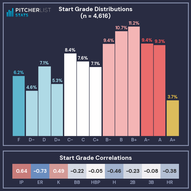
My initial takeaways from this distribution:
- A+ grades are sacred. They are quite rare and should be used for the truly great starts.
- The median grade was a B-, with the average grade between a C+/B-.
- There is grade inflation at/below the median: graders were more likely to give a C- than a D+, or a B- instead of C+.
- There is grade deflation above the median: graders were more likely to give a B+ than an A-.
- Graders seemed content to call a bad start a D or F, rather than use a +/- increment.
- Innings Pitched (IP) ran a strong direct correlation to the Start Grade, while Earned Runs (ER) had an even stronger inverse correlation (more runs = worse grade).
- Strikeouts (K) and Hits (H) also had strong correlations.
- Triples (3B) and Hit-By-Pitches (HBP) had no real correlation to the Start Grade.
Data Analysis
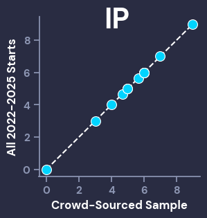
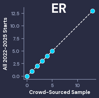
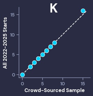
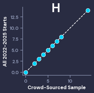
Before we go any further, it’s important to make sure that the distribution of stats from the crowd-graded sample of starts is close to the distribution from the broader population (2022-2025 starts). To visually inspect this, we can use Q-Q Plots, which compare given percentiles from different populations. For our purposes, we want the dots of the scatterplot to line up closely with the dotted line. The Big 4 correlation stats (IP, ER, K, H) all look good, while the other stats also showed that the graded sample of starts was representative of the population, even if they had smaller ranges that aren’t as visually interesting (ex: the most HBP in a start was 4, and the vast majority of starts had < 2).
I will now reiterate that the grades and population data can be found here, so anyone can use that data to create whatever metrics they’d like.
With our representative data in hand, we can begin analyzing it and solving our two problems: determining a crowd-sourced Game Score using box score results, and defining a crowd-sourced distribution of Letter Grades.
Game Score
First step is choosing a feature set to score with. Based on the simple correlations to the Start Grades, I immediately dropped HBP and 3B, and their weak correlations. Additionally, I decided to leave out 2B. This was more of a personal decision, because I wanted this game score to be representative of the box score data that we show on our player cards, which (for space reasons) is limited to IP, ER, H, HR, BB, and K. I then transformed the grades onto a 0-100 scale (F = 0, A+ = 100, and each grade evenly spaced between them).
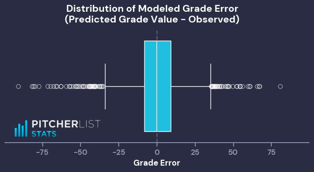
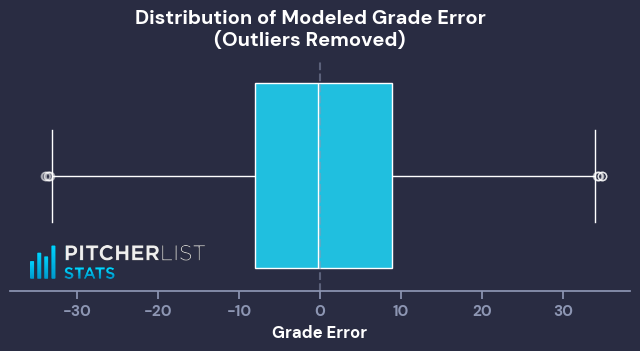
With this list of features in hand, I made a simple linear model to predict the 0-100 Grade Value. This first model is to give us a baseline, because, whether due to clerical error or malicious actors, there are starts that have extreme outlier grades compared to their stats (Ex: an “A” start with 4 IP/8 ER/11 baserunners, or a “D-” start with 6.2 IP/0 ER/10K).
Using this initial model, I flagged any starts where the observed and modeled grade values had a difference of more than 35 as outliers. This returned 109 outlier starts (~2.4% of graded starts).
With our sample trimmed of outlier grades, I ran another simple linear regression on the same features and target, which resulted in the following Game Score formula:

This should cover most use cases, but in the interest of keeping coefficients to nice, whole numbers (while maintaining a similar letter grade distribution), I creatively rounded to:

This formula gives the following distribution of Grade/Game Score Values:
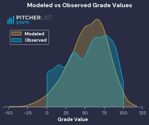
The modeled Game Scores have a much peakier distribution, centered around the observed average, and have longer tails to the distribution. That’s expected behavior for the output of a simple linear model, and good enough for my purposes. We now have our crowd-sourced Game Score.
Grades
With a Game Score formula that I like, I can now apply it to the entire population of 2022-2025 starts, to properly group them into grades. This is a more nebulous goal than the Game Score formula, so I set a few parameters:
- A+ needs to be scarce (<4% of starts, ideally around 3.5%)
- F should be roughly 6%
- B’s should be the most letter
- Frequency of grades should decrease monotonically (or close to it) from B to D-
That last point is the biggest difference from the observed grades. I applied this parameter because it allows the Game Score distributions to better match the grade distributions, and because I wanted to sand down the stark grade inflation from the crowd-sourced set.
The most straightforward way to solve for these parameters was to group based on Game Score percentile. After some trial and error, I ended up with the following thresholds:
| Grade | Min Score Percentile | Min Game Score | % of Starts |
|---|---|---|---|
| A+ | 96.5 | 95 | 3.4 |
| A | 87 | 82.3 | 9.7 |
| A- | 77 | 74 | 9.8 |
| B+ | 65.5 | 67 | 11 |
| B | 55 | 60.6 | 10.9 |
| B- | 45 | 53.6 | 10.2 |
| C+ | 37 | 47.6 | 8.6 |
| C | 29.5 | 41 | 8.3 |
| C- | 22.5 | 36.6 | 5.7 |
| D+ | 16.5 | 30 | 5.9 |
| D | 11 | 22.3 | 5.6 |
| D- | 6 | 12 | 4.7 |
| F | 0 | -46 | 6.2 |
Here’s what that distribution of grades looks like:
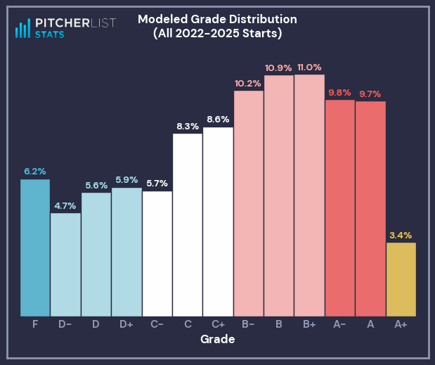
That tracks with my parameters and looks an awful lot like the observed distribution of grades. Now we have both a Game Score formula and a way to transform that score into a letter grade that matches community intuition.
Concluding Thoughts
All in all, this was an extremely fun project that opened my eyes to how the baseball community views start quality. With so many different ways to view “good” or “bad”, I enjoyed cutting through the noise to solve the goals I laid out for the project. This is by no means the only way to meet these goals (as it stands, I have a few other ways I’m looking at making game scores, which have their own pros and cons). My data-driven view wasn’t a fan of the grade distribution at first, but I’ve really come around and have learned to appreciate the wisdom of the crowd.
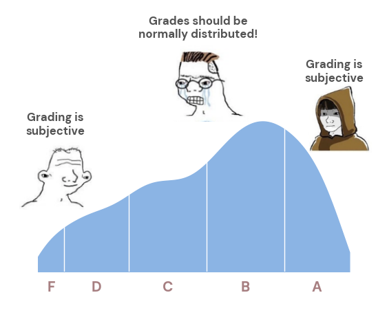
Baseball is a weird sport. No need to try to make it Normal.