


Over the past year and a half, I’ve written a few pieces arguing against using HardHit% and other contact-splits stats to compare players. The argument is simple: strikeouts matter when trying to figure out which players hit the ball hard most often. Similar to why we choose swinging-strike rate over whiff rate because it matters how often players swing at a pitch, we should be choosing stats that account for how often players hit the ball.
The issue, though, is that Baseball Savant’s sliders still stats that don’t do that at the very top. It’s no surprise that HardHit%, Barrel%, Average EV, and xwOBACON are among the first that many analysts look to when they try to describe which batters are best at hitting for power (or which pitchers are best at keeping them from doing so).
I wouldn’t still care about this issue if the underlying ideas behind Savant’s numbers weren’t worth saving. A fixed version of HardHit% would be exceptionally useful because it strips away luck and shows a player’s ability to hit the ball hard. That happens to make it the rare power stat that becomes reliable extremely quickly for both hitters and pitchers.
So, it shouldn’t shock you to know that I’m thrilled with the new PL player pages. Whether you’re looking at pitchers (go check out Zack Wheeler) or hitters (try Joey Votto), the toplines exclusively look at the big picture. Sure, I might quibble with some per-pitch stats like CSW% and SwSt% once in a while, but these pages craft an exceptional fair picture of what players are doing. I’d like to see other sites follow suit, but if they don’t, I’m thrilled that the simplicity they offer doesn’t come at the expense of accuracy.
That means that, at this point, you no longer have to pull HH/PA% using a Statcast search. It’s at your fingertips, with the added aid of telling you whether that breakout candidate you’re researching has been hitting the ball hard more or less often than you’d thought.
So let me summarize: Stop using Savant’s HardHit% and Barrel%. There’s no excuse.
The process of moving our expectations from one “normal” to a new one might be uncomfortable for some people, so it’s worth doing the same as I did for hitters and examining which pitchers would change the most in our eyes as we move from HardHit% to HH/PA% (or HardContact%, as I called it in my previous piece — I’d like to see what the crowd thinks about these naming choices).
The result of the hitter piece was largely that we’re underestimating players who fell in the middle by both strikeout rate and hard-hit rate. As it turns out, decent quality and quantity of contact turn into a lot of hard hits. Well, that same logic is going to be the undoing of a lot of jack-of-all-trades pitchers. And those who can make opposing batters act like Joey Gallo without giving them his same hulking frame are actually doing a lot more than we suspect to limit overall damage.
This change has benefits beyond just fairness. While a pitcher’s home run rate and barrel rate won’t clear a bare-minimum threshold for reliability within one season, both HardContact% and SoftContact% become reliable in as few as six starts, which is faster than walk rate. That suggests a bright future for K+SC% or something similar to it, if not just for HC+BB%.
So, who moves the most now that we’ve put the goalposts back where they deserve to be?
Why We Care: These Numbers Matter Fast
The original research behind HardHit% is pretty simple: batted balls hit softer than 95 mph all lead to roughly the same outcomes, but those hit harder than that deal an increasing amount of damage. That’s why we shouldn’t care about average exit velocity: it’s better to crush a few than to consistently hit stuff that’s just weak enough to lead to outs. Remember all the talk about Victor Robles‘ exit velo numbers and why it’s important to remove the bunts? You were probably better off ignoring that number entirely anyway.
HardHit% was born as a simple solution to that issue. I’ve talked extensively about how it’s unfair to different groups of hitters and batters, but I’ve only spent that time because that concept itself seemed worth looking at. If we’re going to give some pitchers credit for their ability to generate soft contact, then research that precisely defines soft contact seems important.
And, when I looked into which hard contact metrics were best at prediction, description, and stickiness, I found that hard contact data matter a lot for pitchers — more than barrels or walks, even.
| Stat | S1 ERA | S2 ERA | S2 Self | |||||||||||||||||
|---|---|---|---|---|---|---|---|---|---|---|---|---|---|---|---|---|---|---|---|---|
| K% | 0.273 | 0.209 | 0.567 | |||||||||||||||||
| BB% | 0.062 | 0.029 | 0.358 | |||||||||||||||||
| HR/BBE% | 0.228 | 0.000 | 0.063 | |||||||||||||||||
| HR/PA% | 0.333 | 0.009 | 0.062 | |||||||||||||||||
| HR/FB% | 0.238 | 0.001 | 0.014 | |||||||||||||||||
| Barrels/BBE% | 0.180 | 0.013 | 0.097 | |||||||||||||||||
| Barrels/PA% | 0.268 | 0.042 | 0.118 | |||||||||||||||||
| HardHit/BBE% | 0.195 | 0.028 | 0.176 | |||||||||||||||||
| HardHit/PA% | 0.305 | 0.103 | 0.277 | |||||||||||||||||
| Avg. Exit Velo | 0.143 | 0.047 | 0.140 | |||||||||||||||||
| *2015-2019, min 100 IP pitched in both seasons | ||||||||||||||||||||
I originally highlighted HardHit/9 in this research, and it was more descriptive than anything but HR/9 while being nearly as predictive of future outcomes as walks were. That felt like a huge find, but I recognize now that defense and park factors were contributing. Still, the findings for HardHit/PA% (the thing that I think we should call HardContact%) were incredibly positive. If pCRA can beat the field in ERA estimators using Barrels/BBE%, then a pCRA-style estimator using HardContact% should probably be even better.
That said, this test doesn’t tell us much about what’s important in-season, which is where HardContact% really shines. Below is a chart of the number of batters faced that it takes for several important metrics to reach common reliability thresholds. And again, HardContact% beats walk rate — as does SoftContact%, which looks to me to be a clear sign that this isn’t a fluke of covariance with strikeouts (check out an interactive version here).
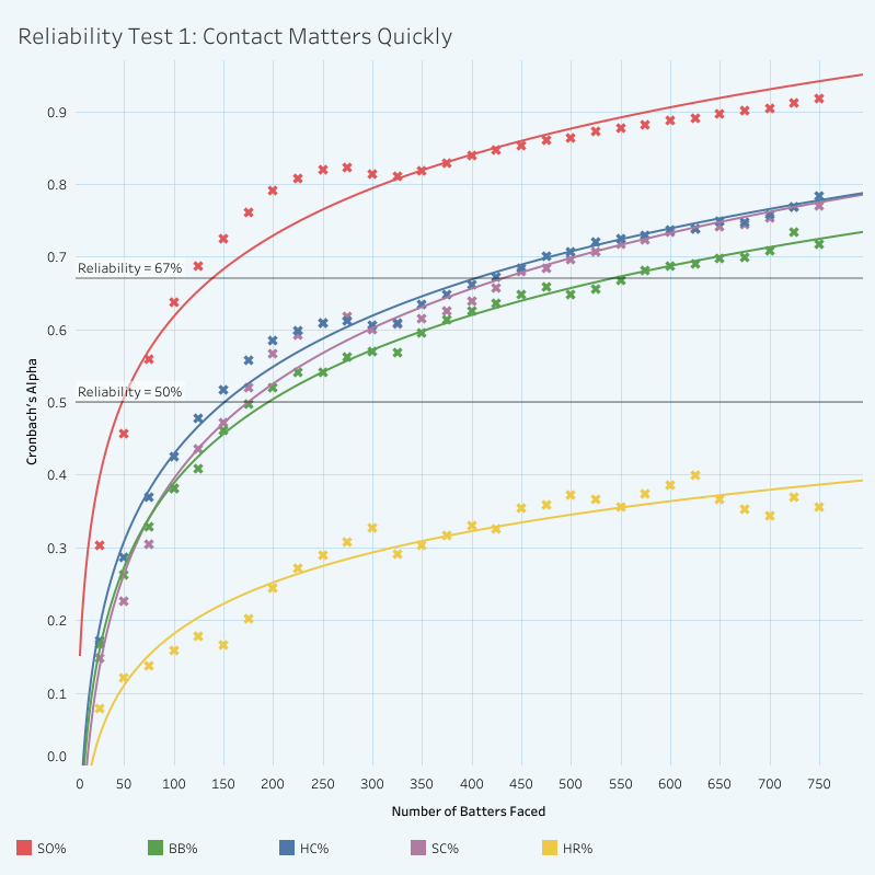
If you’re not familiar with what the scale on the left side of this graph represents, Cronbach’s Alpha tests are a measure of the consistency of a data set. We can use it in baseball contexts to assess how large of a sample it takes for a stat to reliably predict itself going forward.
The higher the reliability, the less we would expect a player’s stats to regress toward the mean over the course of the rest of the season. In this case, 50% reliability would be the mark at which we would expect that future performance will be better predicted by past performance than the league average would be.
So, it’s an absolute coup for both HardContact% and SoftContact% to reliably predict themselves going forward even faster than walk rate does. I take this to be undeniable evidence that a pitcher is able to control the total amount of hard contact or soft contact they allow. And for them to be more useful than league average by 150 batters faced means that we might be able to make use of this information extremely quickly — again, far faster than barrels, which pCRA’s formula assumes take over 200 batted ball events to become reliable.
I also checked in on the in-season reliability of some potential stats featuring hard contact that would be built like K-BB%. I’ll note that this sort of build gives each of them equal weight, and given that pitchers typically rely more on soft contact than strikeouts, I’m not perfectly convinced that 1-to-1 weights are perfect. Nevertheless, I was curious (interactive).
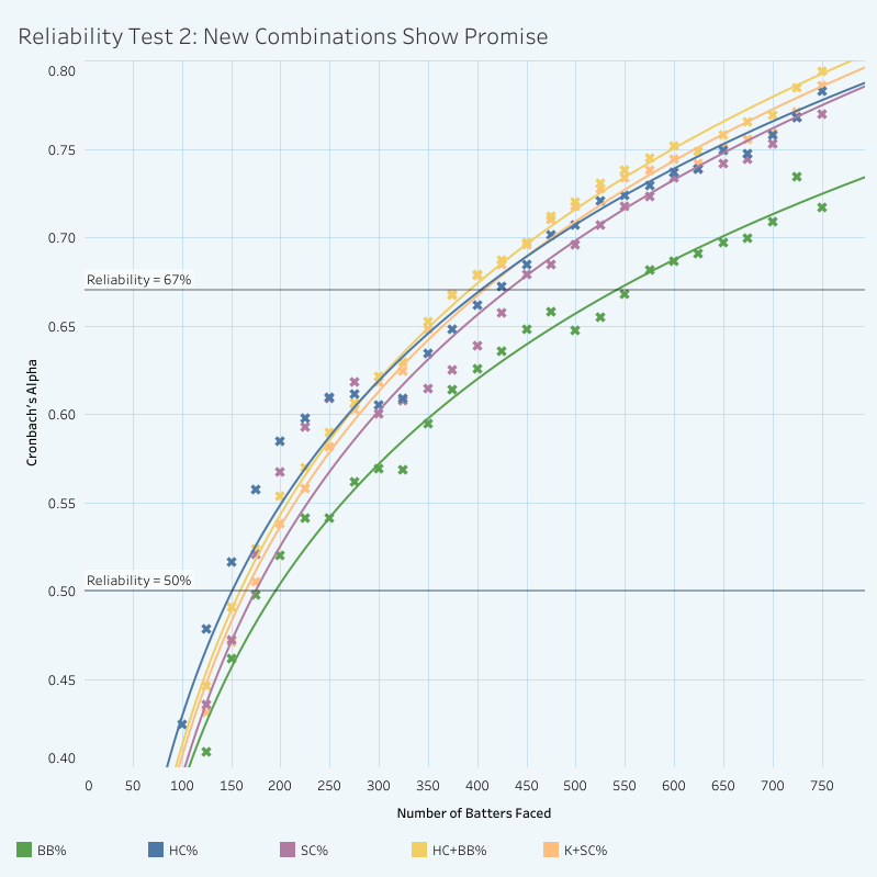
This tells me that we should be able to use different varieties of these stats in-season by about the same time that we would look to K-BB%: six to eight starts.
And, using my same test for same-year descriptiveness as before, I found that K+SC% (strikeout rate plus soft contact rate) correlated more strongly to same-season ERA (roughly 0.39) than K-BB% did (0.32). K-BB% was still better for next-year samples, but I imagine an actual ERA estimator would fix that issue with actual weights.
So, long story short: welcome to the party, K+SC%.
Different Roads to Contact Suppression
It’s not enough to just say “go at it,” though. It’s probably more important to help visualize who this approach to contact suppression affects most.
Because moving from HardHit% to HardContact% means fixing the denominator (yes, scintillating stuff), we can convert from one to the other by multiplying by BBE% — the percentage of a player’s PAs that end in a batted ball. This chart places each of those two factors on the axes and represents the result on the red/green color scale. I’ve also plotted a curved line showing 25.8% HardContact% — the average among pitchers who qualified for percentiles — so that it’s clear how players with very different builds can end up in the same place (interactive).
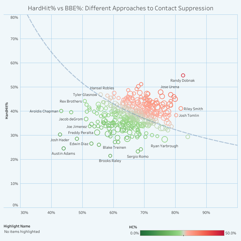
There are a few bottom-left outliers that intrigue me — guys that we know are good but maybe don’t understand just how good. Just five players are allowing fewer than half of their opponents to make contact, and both Josh Hader and Edwin Díaz were doing so with HardHit% numbers at or below 30%. It’s no surprise Hader’s ended up with an almost unfathomably good 12.9% HardContact% is, but it might be that Brooks Raley was actually able to beat that mark by trading a few strikeouts and walks for more weak contact. As for Austin Adams? More on him later.
Before we move on to discuss the players who HardHit% whiffs on, we ought to take a moment to give Freddy Peralta his due. His 17.4% HardContact% was the best among starters to face at least 500 batters last year and the 13th best among SPs in the Statcast era. Doing that in a season not only when he was moved out of the bullpen but also when many pitchers struggled after the foreign substance ban is incredible.
Because HardContact% and SoftContact% combine with K%, BB%, and HBP% to represent every PA, you can create these pie charts that represent how I tend to picture these stats together. I’ve updated them slightly for pitchers to represent what I’m interested in; here’s Peralta’s to truly map how incredible he was last year (I’ve made Peralta the default view for the interactive, but you can search any of your favorite pitchers here to see how they stack up).
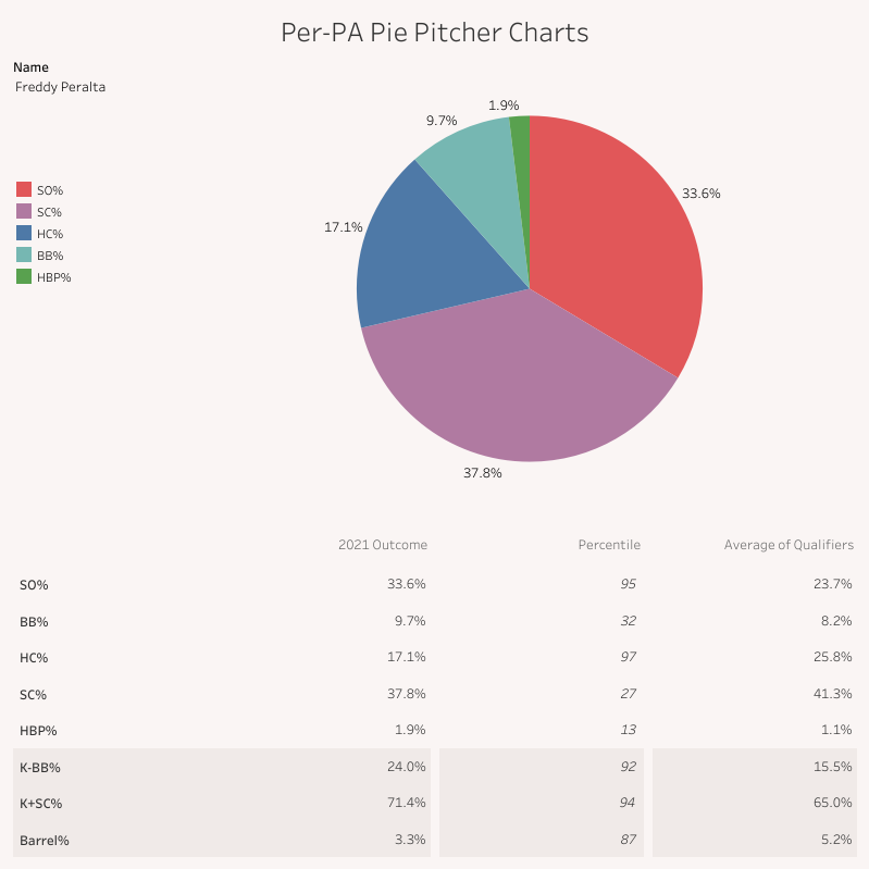
It should be no surprise that Peralta was among the very best at this despite his occasionally erratic command. I should also note that the benchmark I’m using for qualifiers here and everywhere is the same that Statcast uses for its percentiles, which is 200 batters faced for pitchers. So, he wasn’t just the best starter by HC% — only 7 starters faced as many batters as him and beat his 71.4% K+SC%. Even holding him accountable for his flaws, it’s hard to doubt Peralta’s success last year was anything less than earned.
Whose stock moves most?
Like I did for hitters, I’m using change in percentiles as a proxy for how much a player might move in our eyes. Where I had to differ this time, though, was in the playing time benchmarks. I didn’t run percentiles for any hitter under 350 PA because those players don’t get a HardHit% slider. Pitchers only need 200 PA to get one, though, so I’m including them as well. And that means there were far more pitchers who moved a lot.
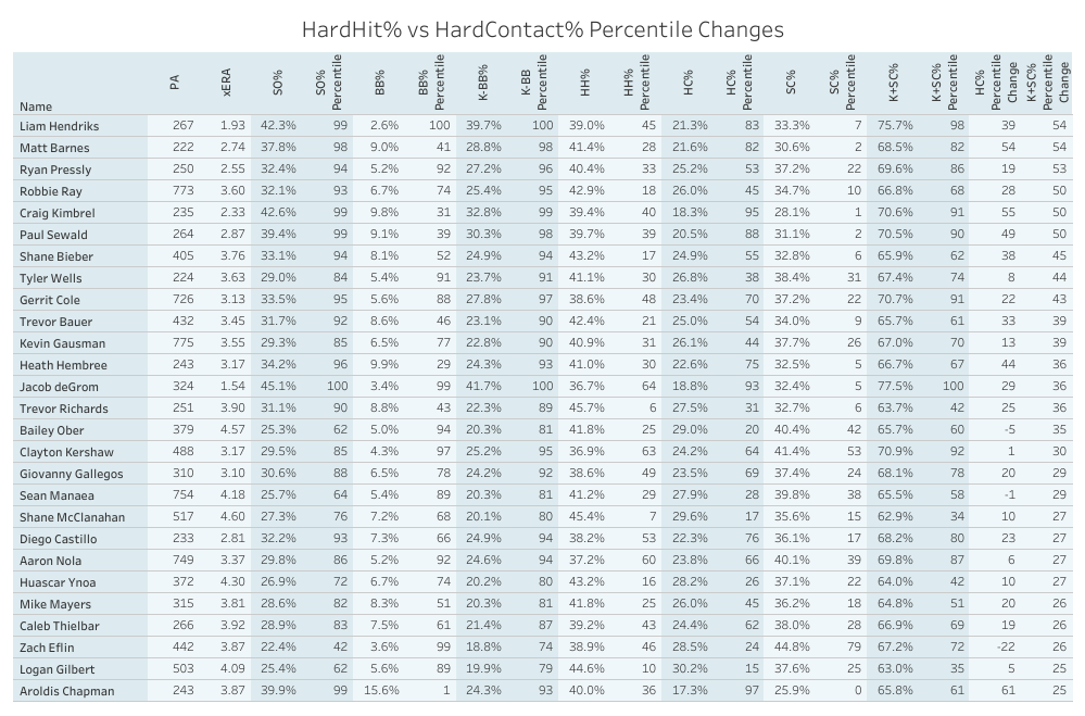
So, I’m separating them out arbitrarily into 200-349 PA and 350+ PA bins. First are the “starters” who moved up more than 20 percentiles.
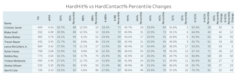
Shane Bieber is probably the pitcher that first comes to mind when I think about this shift. The fact of the matter is that his not-so-great fastball doesn’t get hit all that often. It’s a liability, but so too is “not striking anyone out.” He doesn’t suffer from the latter. So, when I’ve tried to capture why HardHit% is next-to-useless on its own as a way to capture pitcher performance, his reputation as someone who gets hits really hard when batters do make contact (and the frequent lack of follow up on the “and how often is that?” question) has frequently come to mind.
His peers on this list should be a solid indication of the issue at hand. All but two are in the top 15% of qualifiers in strikeout rate (and remember, that includes a lot of relievers ahead of them). The two exceptions, Triston McKenzie and Lance McCullers Jr., have walk issues that push down their total number of batted balls as well, but that’s something we can account for in a moment. It’s crystal clear that HardHit% is less likely to accurately capture the contact suppression abilities of good pitchers — and that’s who we care about most, isn’t it?
Let’s check in on the relievers and short-season starters next. Given how many of them moved wildly, I’ve limited it only to those who moved more than 25 percentiles.
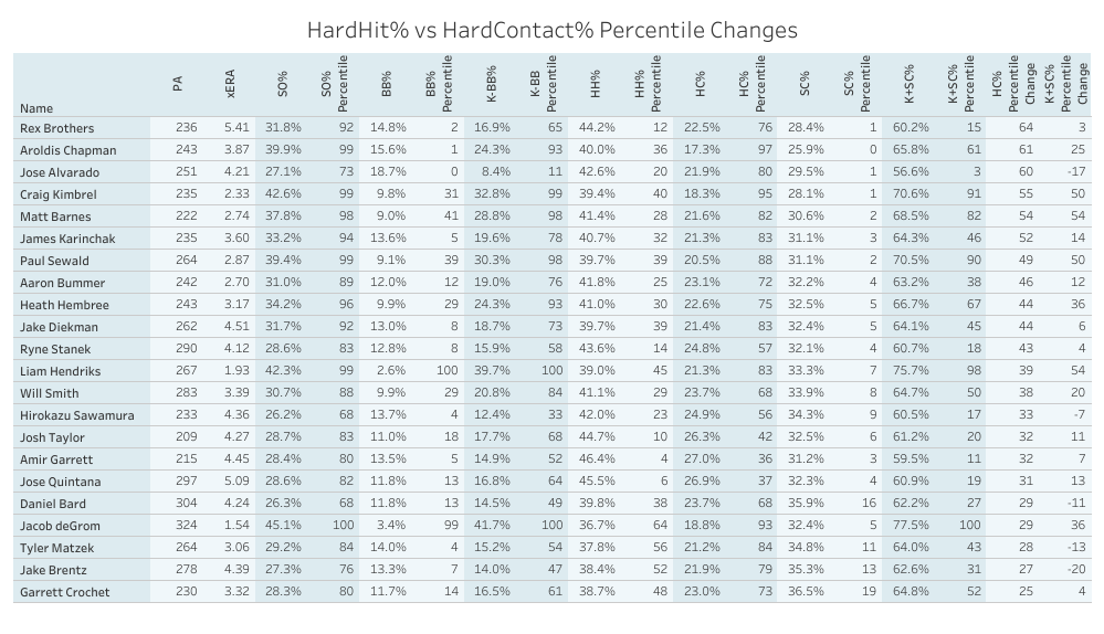
Continuing the trend of “everyone is either elite or walking every batter they face,” please say hello to Jacob deGrom, Liam Hendriks, Aroldis Chapman, and Rex Brothers. You can be both, I suppose.
This chart is the case for creating K+SC%. Many of these pitchers are avoiding hard contact by failing to hit the strike zone, which could give the appearance that they’re exceptionally good. So, instead of tracking the bad results, let’s track the good results! It’s no shock that deGrom and Hendriks are elite, Chapman was just okay in a season where he struggled with command after the sticky stuff ban, and Brothers was bad, actually. Also: treat this as more Paul Sewald propaganda, if you’d like.
So, if we can pretty conclusively show that many elite pitchers are being underrated by HardHit%, who’s being overrated? I’ll let you take a guess.
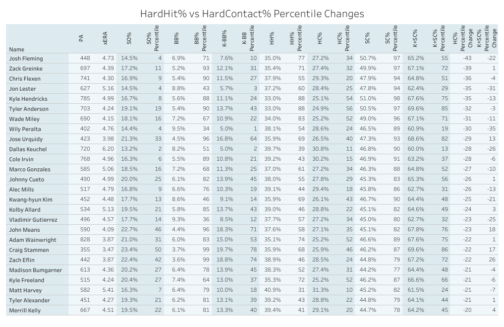
So, we have to talk about the Kyle Hendricks of it all, don’t we?
Hendricks has been the go-to outlier that the ERA estimator of your choice can’t predict for years — or at least he was until this past year. A key part of his success in previous campaigns was his ability to sustain a HC% that stood out among the league’s best. From 2015 to 2017, he never allowed more than 21% of batters to turn their PAs against him into hard-hit balls (roughly top 20 among all SPs, and 4th best in 2016). That number has crept upward each year since, and in 2021, he finished just above league average in terms of hard contact allowed. His HardHit% has ticked up just a point or so each year, but couple that with a slipping strikeout rate, and you have a recipe for his fall from elite to pedestrian.
There aren’t many exciting names on this list, but I do know that there are José Urquidy fans out there. The story for him is simple: his stuff rates well, his HardHit% is good, and he might put it all together. He doesn’t rate all that well by HC%, but he does by K+SC%, which makes sense; he’s not striking out or walking all that many batters, so while there’s a decent amount of hard contact, the lack of walks evens things out somewhat. Color me intrigued.
The same roughly goes for John Means, who should benefit a good deal from not pitching in one of the most absurd home run environments for righty hitters. He might have to hope that the O’s put someone decent in left field, though.
As for the rest? Pass. I don’t think you needed me to tell you that. Just be careful when someone with prospect pedigree puts up a profile like any of these through their first six to eight starts — they’ll probably need some time to make adjustments before you can believe in them.
Finally, the relievers that fade, with the same note that I’ve moved the cutoff up:
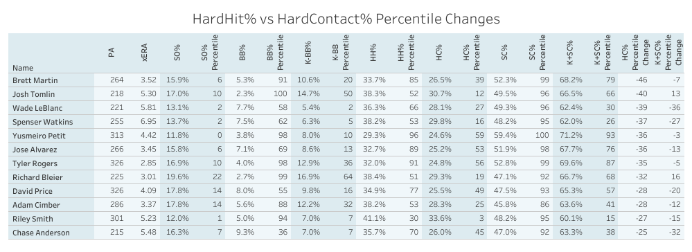
Is there such thing as a Toby closer? Arguably yes: Tyler Rogers certainly held that role for much of the 2021 season for the Giants. There are some interesting names in this tier, but I’m not going to go as far as to say that it’s full of players that are even worth monitoring.
For fantasy purposes, you’d need to hope they have an excellent role given the strikeouts you’re losing. Some of these arms were actually suppressing hard contact, but many of them were giving up considerably more than average. You’d need something like HC% to tell you that, and then something like K+SC% to inform you about whether that approach was working overall. For most of these names, it wasn’t.
Finally, it’s worth our while to check in on who changes most when we compare HardHit% percentiles to K+SC% percentiles. This time, many of the pitchers with poor command don’t move up the list, and only the cream of the crop remains.
Okay, okay, it’s not exclusively elite pitchers. But by and large, these are arms we’re interested in because of their strikeout potential and reasonable command. Even those who weren’t terribly successful last year are intriguing; Bailey Ober and Shane McClanahan both showed promise. Even if they allowed more hard contact than we’d like, neither of them walked all that many batters. All told, their warts were limited — hence their movement up the ranks.
On the other side of things, very few names inspire confidence. That said, so many pitchers fell off the map when I made this change that I limited it to those who fell 30 percentiles or more.
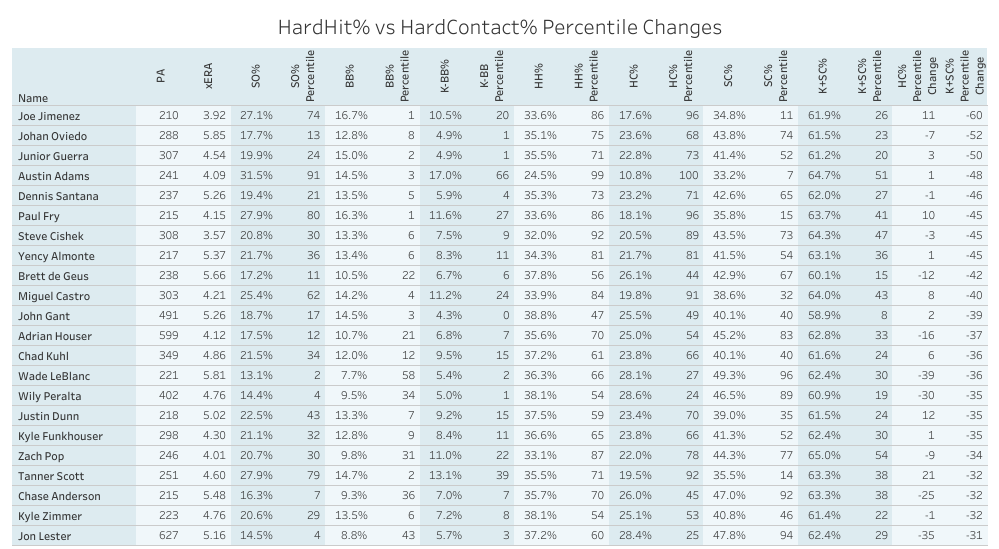
Remember Austin Adams from the bottom left of the HardHit% and BBE% chart? Here he is again — that’s what happens when you either walk or hit nearly 25% of the batters you face.
What comes next?
I’m hoping that I can continue to bug Nick into updating the PL7 pages as we continue to find new and helpful ways to interpret contact suppression. Who knows what the March update that will include projections and other changes will bring? (Nick does. that’s who.)
While I’ve settled in on K+SC% as the version of this I’m most interested in, there’s plenty more that can be done with this information. I feel weird claiming ownership over an idea that feels as obvious as this one does — it seems almost like a mistake that we’re having this conversation at all, really.
I still point back to Baseball Savant’s Barrel and Exit Velocity leaderboard, which uses Barrel/PA% as their default sort. The site’s cornerstone stat is conveyed in its most useful form there, but nowhere else. I’ve always interpreted this to mean that they know it’s preferable to the per-PA version when comparing players. And still, it’s found nowhere else.
I’m glad to know that that will be changing, even if they aren’t the ones making the change.
Photo by Dan Sanger/Icon Sportswire | Design by Michael Packard (@designsbypack on Twitter @ IG)
