


What constitutes a good trip to the plate for a hitter? Is that a tough question to answer? We know what the good outcomes are. Anything that results in the hitter reaching base safely is a good outcome. Making an out is a bad outcome. That’s pretty straightforward.
But we know it’s not that simple. Outcomes like being safe or making an out are proxies that we use to help us understand what might be taking place on the field. But we know they are incomplete and we can do better.
We’ve always understood that hitters have limited influence and control over the outcomes of their plate appearances. They can do everything “right” — like getting into a favorable ball-strike count, getting a good pitch to hit, putting a good swing on it, and hitting the ball hard somewhere in play — and still make an out.
If we’re only looking at outcomes, we would tally that plate appearance up in the bad column. But would that example be a bad trip to the plate? Just because the hitter made an out?
The Canonical “Quality AB” (err… PA)
Amateur baseball coaches have long made popular the idea of the “Quality At Bat” or QAB. The exact criteria vary from coach to coach, but typically include things like walks, hit-by-pitches, reaching on errors, hard-hit balls, advancing runners into scoring position, making the pitcher throw a lot of pitches (6 or more), driving in a run, and sacrifice flies and bunts. You might have even kept charts of such things if you played in high school or college. Perhaps, if you’re like me, you also grumbled about how it really should have been named the Quality Plate Appearance instead of the Quality At-Bat.
Those things, the thinking goes, are less about the outcome of the plate appearance and instead about the process: things a hitter can try to do that are thought to help the team offense be productive.
At the Major League level, the current analytic age ushered in by treatises such as The Book has helped us refine these criteria. For example, we now know that advancing runners with an out, say from 2nd to 3rd by hitting behind them or sacrifice bunting, is often not worth the cost of the out, except in specific circumstances (see The Book Chapter 9).
Similarly, the value of driving up pitch counts can be questioned. There probably is some value in this, although it is likely marginal and may even be diminishing in today’s high-octane bullpen environment. Somewhat gone are the days when knocking the starter out early meant dealing with the soft underbelly of the opposing bullpen and wearing out a ‘pen for later in the series. Today, even the bottoms of MLB bullpens include pitchers possessing plus stuff and teams are quick to call up fresh reinforcements from the minors when a bullpen gets stretched.
Continuing through the list, reaching on errors and getting hit by pitches, while typically positive events for the hitter, happen infrequently at the major league level, and tend not to be things the hitter has much control over.
Therefore, the majority of the focus for MLB hitters’ training and development tends to go toward their plate discipline (i.e., not chasing balls to draw walks and swinging at pitches they can drive) and their power (i.e., hitting the pitches they can handle hard.)
The Statcast Era
Statcast and its ability to measure the speed, direction, and location of pitches around the strike zone and batted balls all over the field has brought greater fidelity to our understanding of how well hitters do these things and which things are important for them to do well.
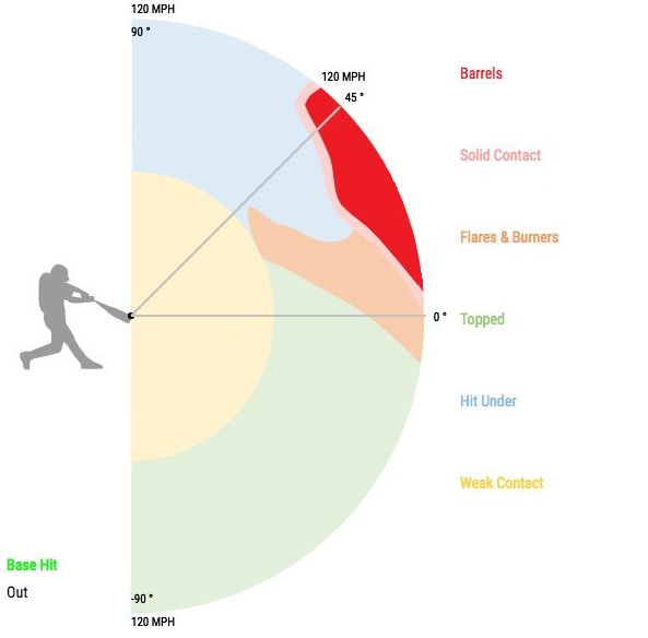
Not long after Statcast was implemented we learned, based on the offensive production of batted balls at different exit velocities, that “hard hit” balls were those with an exit velocity off the bat of 95 mph and above. That was because batted balls hit that hard were, on average, significantly more productive than those hit below that benchmark.
Blog Post: Statcast Lab: Why is the Hardhit rate at 95+ mph? https://t.co/Z6pqwsj7Ms pic.twitter.com/INqx67AkmW
— Tangotiger 🍁 (@tangotiger) June 18, 2023
We also learned from Statcast data that a specific subset of those 95+ mph hard-hit balls at optimal launch angles, labeled “barrels,” were the most productive of all.
And we learned that hitting the ball extremely hard was not the only way for hitters to be productive. Other batted ball categorizations, like “flares” and “burners”, were also found to be very useful because of how often they fell in front of outfielders or scooted through infields for hits.
Those new measurements spawned a new age of analysis and metrics that analysts like me quickly flocked to use to make assessments about how players and teams might perform in the future. We got hard-hit rate, barrel rate, and a whole suite of “expected” statistics based on exit velocity and launch angle and a few other variables that tried to tell us what a hitter should be producing based on the contact they were making.
Not Exactly As They Seem
Pitcher List’s Alexander Chase was a leader in pointing out a critical nuance about these new contact measurement stats: hard-hit rate and barrel rate were using a denominator of batted ball events, not all plate appearances. Three true outcomes sluggers like Joey Gallo and Miguel Sanó were routinely on top of the hard-hit rate and barrel rate leaderboards. Chase’s finding helped explain how someone like Sanó, and his prolific tendency to strike out, often did not produce at the levels his batted ball data might suggest.
Pitcher List’s Jonathan Metzelaar broke down barrels, flares, and burners in a great piece back in 2020 and showed how flares and burners help to explain the productivity of a hitter like Luis Arraez, who does not often hit the ball hard by the Statcast definition, yet sprinkles base hits all over the field year after year.
You can see in the graphic above that the exit velocity and launch angle criteria for barrels, solid contact, flares, and burners are dynamic combinations and therefore, fairly complex. The same can be said of the various “x-stats,” especially expected weighted on base average (xwOBA).
Metzelaar proposed then, partly for convenience and simplicity, that those batted ball categories could be aggregated together and divided by batted ball events into a composite metric that he called “Ideal Contact Rate.”
The Ideal Plate Approach
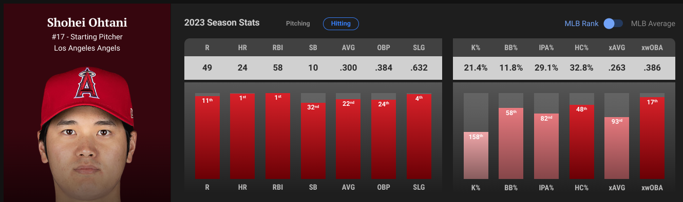
That aggregate concept — (Barrels + Solid Contact + Flares & Burners) / batted ball events — formed the basis for a simple metric that we now host on all of our player pages called “Ideal Plate Appearance” or IPA%. You can see it there on the right-hand side of this screengrab of Shohei Ohtani’s hitter page, right next to hard contact rate, the batted ball event version, (HC%) and expected weighted On Base Average (xwOBA):
The PL Glossary now defines IPA% as (Barrels + Solid Contact + Flares & Burners) / Plate Appearances. Somewhere along the line, the denominator was updated to plate appearances. As Chase’s work before made clear, evolving this metric to a plate appearances denominator is a positive development.
But it also introduced a different gap. As currently defined, IPA% tells us how often, as a percent of their plate appearances, a hitter achieves ideal contact. It does not, despite its name, tell us how often a hitter achieves an ideal trip to the plate.
Going back to the introduction of my article here today, those ideal contact categories are just a few of the ways a hitter can have an “ideal” plate appearance.
That was one of the points our Christian Mack made when he introduced what he called the Ideal Plate Approach. Mack proposed two improvements to the ideal contact rate-driven version of IPA%.
The first was the inclusion of walks in the formula. If we’ve learned nothing else from the past 20+ years of baseball analysis, it’s to value hitters that get on base. Therefore, if we want to understand how often a hitter has an “ideal” plate appearance, we have to include drawing walks.
The second improvement was weighting the variables by their runs above average (i.e., linear weights). Metzelaar’s version had a barrel being just as valuable as solid contact and flares/burners. But we know barrels are more productive, so it made sense to give them more weight in the evaluation and Mack used the following formula: (Barrels/PA x 0.89) + (Flares+Burners/PA x 0.24) + (Solid/PA x 0.25) + (BB% x 0.29).
Modifying The Ideal Plate Appearance
So, why do we have all these metrics? At their most fundamental, all of these are about trying to parse a hitter’s process from his results. Whether you prefer the QAB, or a hard hit ball, or IPA%, or xwOBA, we’re looking to those to understand how often a hitter is doing the types of things that we have shown to lead to production.
Some are simple. Some are complicated with lots of math. But, at a high level, their trying to do similar things. But is one better than the others? Are the more complicated options more predictive? How fast can we trust any of them?
With the help of Jeff Nicholas from the Pitcher List data team, I evaluated how well these various metrics correlated with player productivity (measured by weighted on-base average (wOBA)).
I also included a couple of my own proposed updates, following the thinking of the QAB criteria. I think it could also make sense to include hit-by-pitches, sacrifice flies, and sacrifice bunts and flies, which, despite their infrequency and diminished role in overall strategy and gameplay today, still are marks of a player having a productive trip to the plate.
If we add these additional categories to our existing IPA% metric, we would have a modern, more complete version of the “Quality At Bat” criteria that coaches have loved for decades. I explored two updated versions of this. One based on the ideal contact categories and one just based on hard hit balls:
- IPA% 1 = (Barrels + Solid Contact + Flares & Burners + BB + HBP + SF + SH) / Plate Appearances
- IPA% 2 = (Hard Hit Balls + BB + HBP + SF + SH) / Plate Appearances
I also wanted to explore if we could get similar results with simpler metrics. After all, to quote Leonardo da Vinci, “Simplicity is the ultimate sophistication.” So, I included one more option:
- IPA% #3 = (Hard Hit Balls + BB) / Plate Appearances
IPA% Correlation with wOBA
With data from FanGraphs and Statcast, I calculated each seasonal stat for each player season in the Statcast Era (2015-2022, excluding 2020 for obvious data noise reasons). There were 968 player seasons in my data set.
Right off the bat, I was encouraged by my new proposed measures. Last season’s leader in all three of my versions of IPA% was Yordan Alvarez. The MLB leader in 2021 in all three versions was Juan Soto. I’m not a metric design expert, but when you’re designing a metric to evaluate offensive approaches, it’s encouraging to have names like these leading the way!
Moreover, all three also showed a strong correlation with wOBA. Below is a table that summarizes the seasonal and 2015-2022 overall Pearson product correlation coefficients (r) of all the metrics with actual wOBA.
You can see from those results the relationships vary across the board. In terms of correlation, xwOBA takes the cake with the strongest relationship with wOBA, which is not surprising since it factors in a greater number of variables (including running speed on certain batted ball types) than the others.
In terms of the new proposed IPA% metrics, IPA% #1, or the version that includes barrels, solid contact, and flares and burners, appears to be the best-performing metric in the set, just slightly eeking out a better r^2 than Mack’s version.
The IPA% versions that use hard hit percentage don’t correlate quite as strongly, but they do track with wOBA better than our current version of IPA%, based on ideal contact rates, and both versions of hard-hit batted balls, which are the weakest relationships in the set.
This all suggests we might be on to something here with the new options.
IPA% Reliability
Next, I wanted to understand how quickly we might be able to “trust” the new metrics and how that compares to the other measures.
Jeff worked up some reliability analyses, using Cronbach’s Alpha. This is also known as tau-equivalent reliability and is an approach that is widely used to determine when a baseball statistic is more signal than noise. The closer the alpha is to one, the more reliable the observed stat becomes, and that happens as the sample size grows. Essentially, this analysis tells us at what point stats can be reasonably trusted for prediction. If Cronbach’s Alpha is above 0.70, it’s generally considered to be good reliability. That’s the arbitrary, but rational, line in the sand where we think we are accounting for the majority of the variance in a sample.
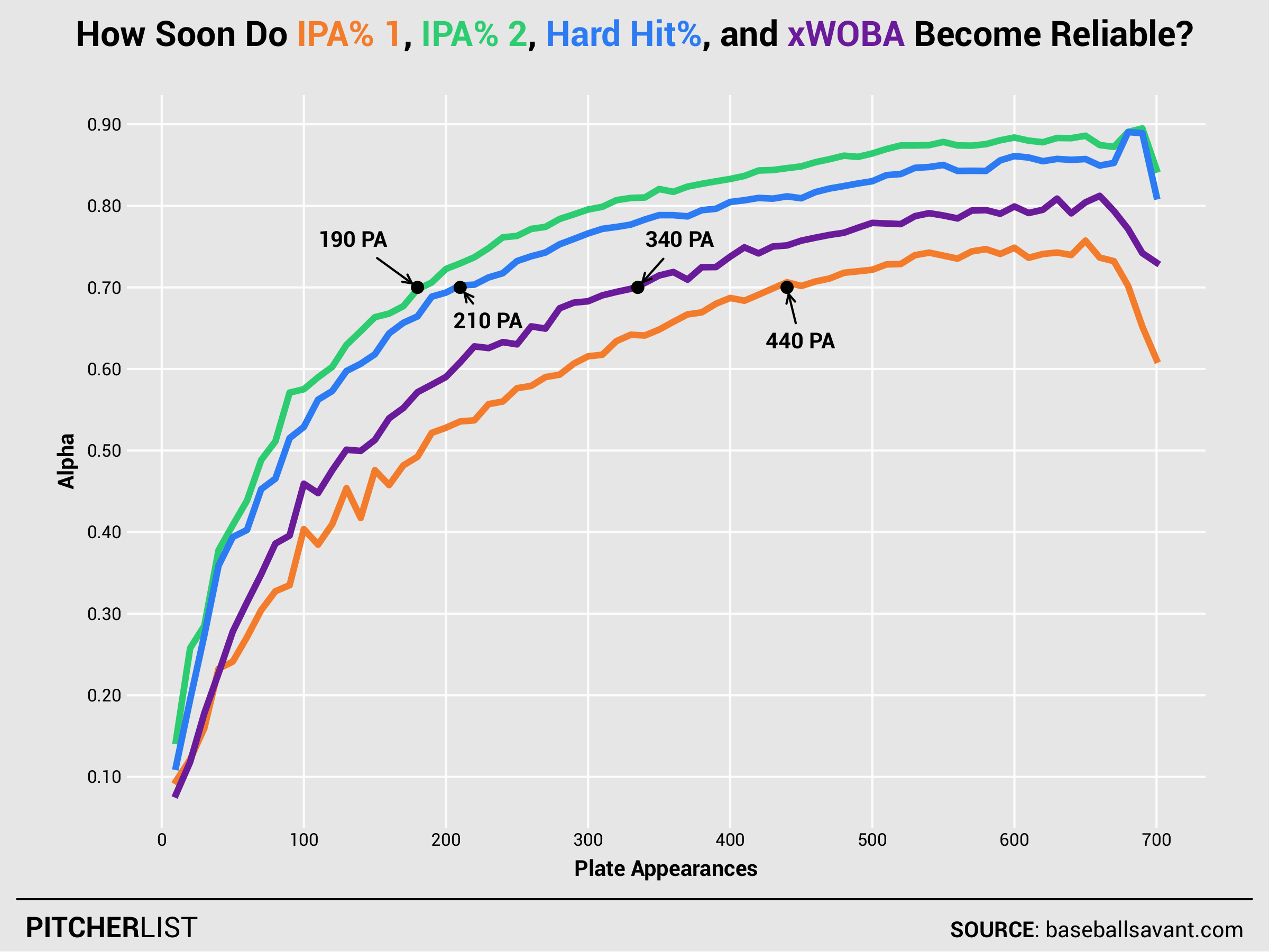
You can see in the plot, the new IPA% 1 — version based on ideal contact bins — “stabilizes” more slowly than hard-hit rate and xwOBA do. That version reaches the 0.70 alpha benchmark in about 440 plate appearances and compares poorly to the 330 PAs required for xwOBA and the 210 PAs required for hard-hit rate.
Line drive rate is notoriously slow to stabilize compared to other batted ball types. It requires about 600 balls in play, which is more than a full season’s worth of plate appearances at the hitter level. By contrast, just 80 balls in play are required for ground ball and fly ball rates to stabilize. Since barrels and flares are likely to be correlated with line drives, perhaps it makes sense why this version of IPA% would be slower to stabilize.
On the brighter side, the new IPA% 2 — the one that used hard-hit batted balls — stabilized in just 190 PAs!
This also makes sense because exit velocity, which “hard hits” are based on, is comparatively quick to stabilize at just more than 40 balls in play.
This is a very exciting discovery. We saw in the summary table of correlation coefficients above that IPA% 2 has a slightly weaker relationship to overall offensive production (as measured by wOBA) than IPA% 1, and it is weaker compared to xwOBA, but it has a stronger relationship to wOBA than hard-hit rate and becomes useful much more quickly than xwOBA.
We give up a little bit of signal in exchange for being able to trust it sooner. I think that can be a trade worth making in certain situations!
Conclusion
Based on these analyses, the metric Ideal Plate Appearance (IPA%) should probably be updated to the following formula:
- IPA% = (Barrels + Solid Contact + Flares & Burners + BB + HBP + SF + SH) / Plate Appearances
This is a more complete representation of the good things a batter can do in a plate appearance than our current version. It also happens to correlate better with wOBA than our current version and more closely than all the process indicators I evaluated, besides xwOBA.
While this version is more complete, it has a significant downside in that it stabilizes slowly. So, if it’s early in the season or we have a small sample from a new call-up, we might be better off trading the contact quality bins for hard-hit batted balls in the formula.
That simpler version has a better signal than our typical hard-hit rates and also becomes reliable faster. And for those who really prefer simplicity, you could even just use hard-hit balls and walks divided by plate appearances as the rough shorthand approach for IPA%. That will approach will give you nearly the same level of correlation as the more complicated versions above.
In the future, work will be needed to determine the year-over-year “stickiness” of ideal plate appearances. That is, how well does a player’s IPA% in one year correlate with their IPA% in the next? Is IPA% a repeatable skill? And which of these metrics best reflects that?
Bonus:
Thank you to Jeff Nicholas of the Pitcher List Data team for critical assistance.
